


4 Easy Steps to Creating Unique Color Schemes
Color Schemes: 4 Easy Steps to Creating Unique Color Schemes that will help you skillfully and confidently use color so you can create your ideal style.
Why am I doing this post just about color?
Before decorating your home and defining your taste in style, you have to be aware that every color has a psychological influence on feelings and moods. By choosing a specific color, you can adapt to that feeling.
I’ve been using this trick for years when choosing clothes and designs. After I learned how colors are influential in making a difference in human psychology, I gave it a chance.
Before that, I used to be frustrated and anxious to find the right outfit to suit my daily mood.
I always prepared what I should wear the night before by looking at the weather. However, what I felt like wearing still changed in the morning. Are you familiar with that feeling?
Eventually, after long hours of staring at my closet, I felt sick and tired. Not such a great start, right?
Discovering the magic of colors to affect the mood helped me to get through this dilemma.
In the end, if you know what you want, it is always easier to make choices. Never underestimate the power and importance of colors on your home, your style, and every piece of design.
My Goal:
I will help you become more confident in using colors to find your own style and make your living areas unique to your personality.
In this blog, my topics will cover decoration tips to the fundamentals of style. However, you can start on your journey like me by making small changes using colors.
[lwptoc]
Basic Color Theory Lesson
Don’t be scared when you see the word ‘Theory’ in the heading. It looks like something academic, but I promise it’s not.
It is just about the basics of color terms. I thought that this will be important when you start to design in real life. It gives you the confidence to discuss color with anyone (anyone being your local painter or your husband 🙂 )
You NEED to learn to precisely describe what kind of paint color you want. You need to know the right vocabulary so you can explain what you want.
Hue = another word for color
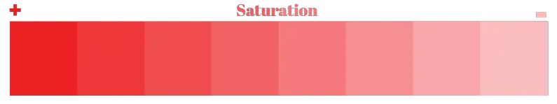
Saturation = intensity, brightness or purity of a hue
Value = refers to how light or dark a hue is
Temperature = describes whether a color is cool or warm
Warm colors include red, yellow, and orange. Cool colors include green, blue, and purple.
Tint = adding white to a color to lighten it. For example, pink is a tint of red.
The opposite of this is:
Shade = adding black to a color to darken it
Tone = adding gray to color to mute it
That’s it for the theory part. I tried to keep it simple and helpful. Now you can use these terms anywhere you want.
You can test it in your local paint store: “I like this hue, but do you have more tinted options?”
Go and explore it. Unless you try it, you won’t see any results.
I have one interesting story for you who loves learning new things! It is about a mysterious pattern behind color names around the world.
How to Create Color Wheel Combinations
The Color Wheel is one of the most practical tools that you can use to create a whole color scheme. It’s a primary tool that every designer uses.
First, you NEED to know how to read the color wheel to use it. I am going to take you back in time. Remember your art classes in elementary school. Teachers mentioned three primary colors, which are blue, red, and yellow.
The logic behind this is that you cannot mix any other color to create these colors, so they are the building blocks of the color wheel.
The secondary colors are purple, orange, and green. These colors are a mixture of the primary colors. The best way to see this is in watercolor drawings. You can use primary colors using watercolor to create secondary hues.
Tertiary colors are the mixture of the primary and secondary colors. These are blue-purple, yellow-green, red-orange, etc.
Think of a compass; other than the main directions, we also have secondary routes such as northwest, southeast, etc.

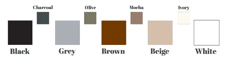
Apart from the primary colors in the color wheel, we also have neutrals—white, brown, black, gray, and beige.
Now we know the basics, let’s skip to how we use it. Many color scheme ideas can be created by a color wheel.
Three major color schemes design:
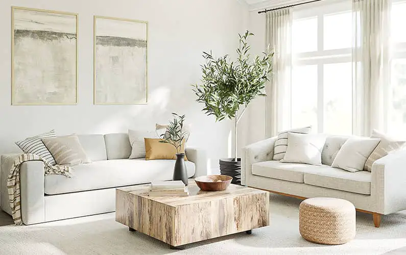
Monochromatic Color Scheme
This means that you are using different shades and tints of the same color. This scheme is perfect for those who don’t like color mixture. Use 3 or 4 shades or tints at least, and don’t forget to add a lot of texture and details to avoid being boring.
The key point is using darker and lighter values of the hue and stick with the color family. For example, if you choose blue as the primary color, don’t use violet-blue or blue-green, it might look good, but it’s not monochromatic.
Now here are some suggestions: don’t use this scheme when you are designing the whole house. It will be suitable just for one or two rooms. In my opinion, the best space is to use this scheme in a kid’s room.
Analogous Color Scheme
It means creating schemes of colors that are closer to each other in the color wheel.
You can make a difference in your bedroom with this color scheme.
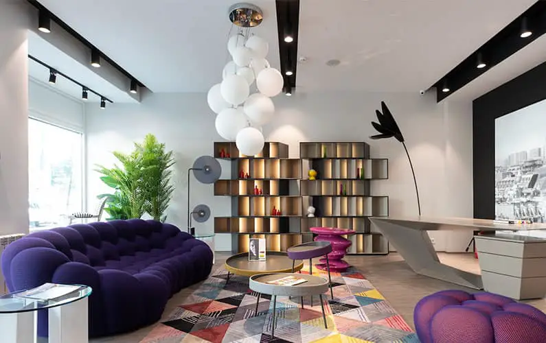
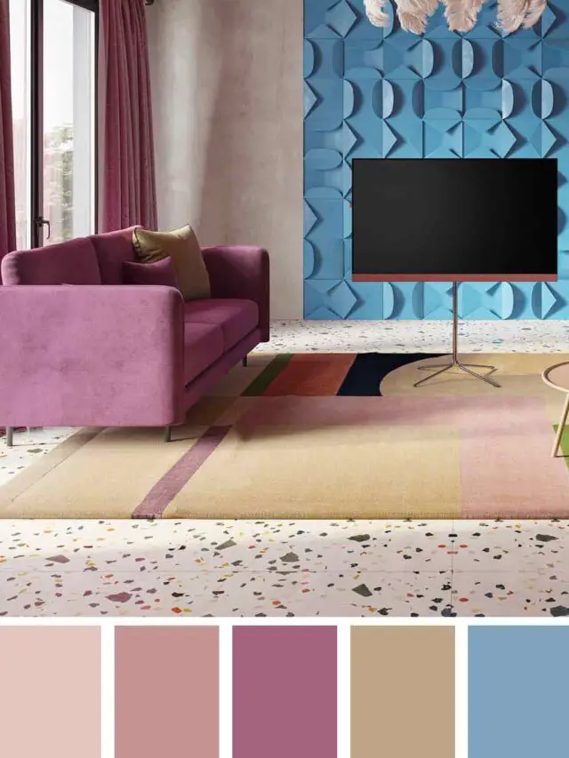
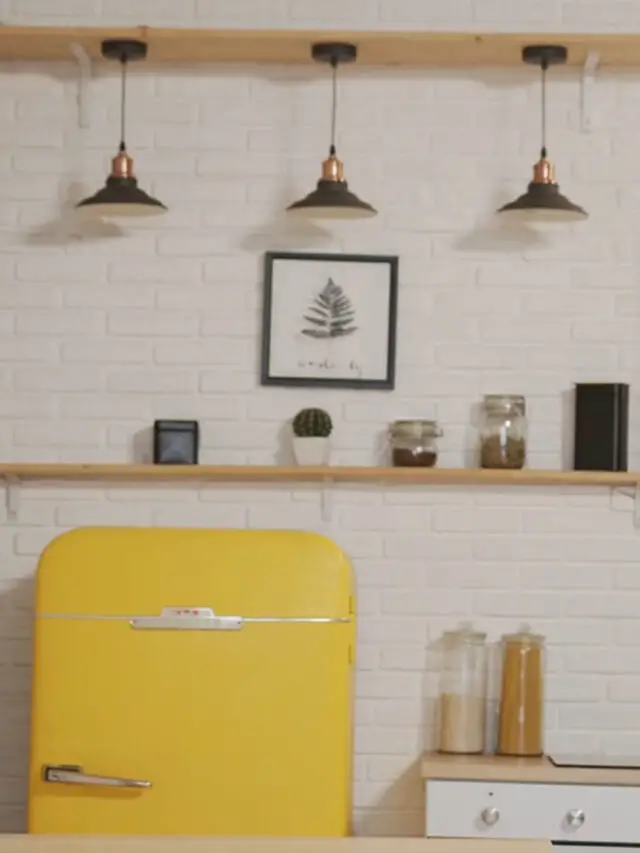
Complementary Color Scheme
This color scheme refers to the usage of opposite colors in the color wheel. It will automatically create a mood or temperature which is more neutral. Because one of the colors is warm, but the other one is cool.
Don’t make them both saturated colors, it will be risky; one color should be muted. Chose two opposite colors and use the tints or shades.
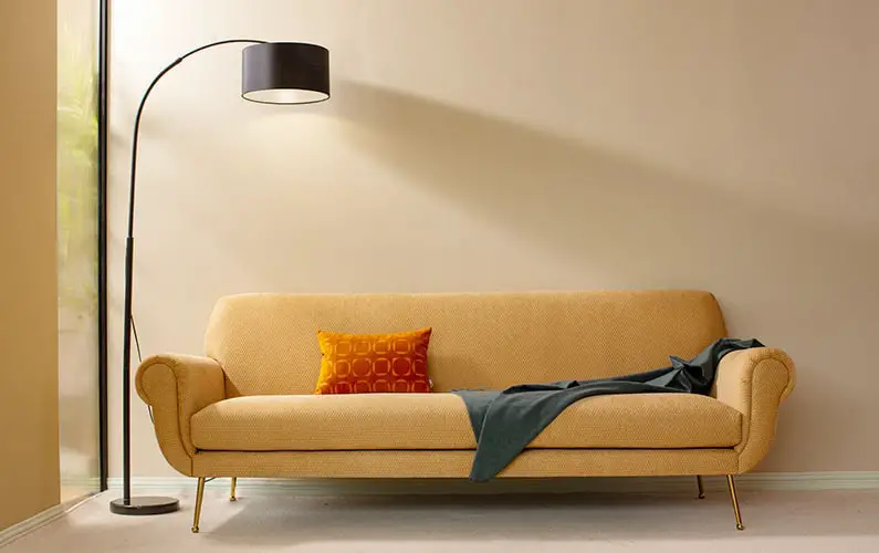
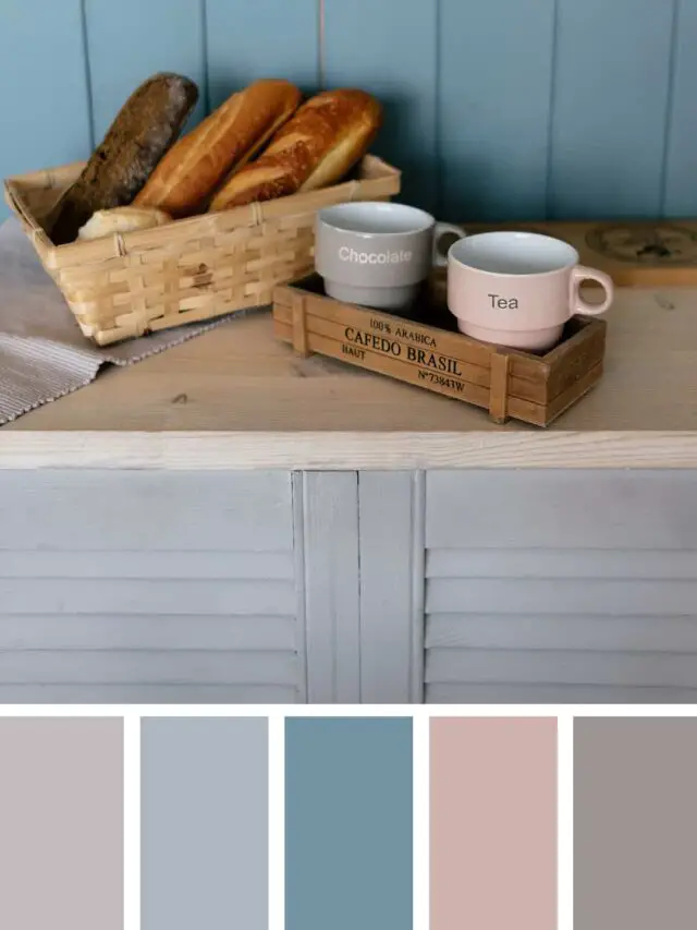
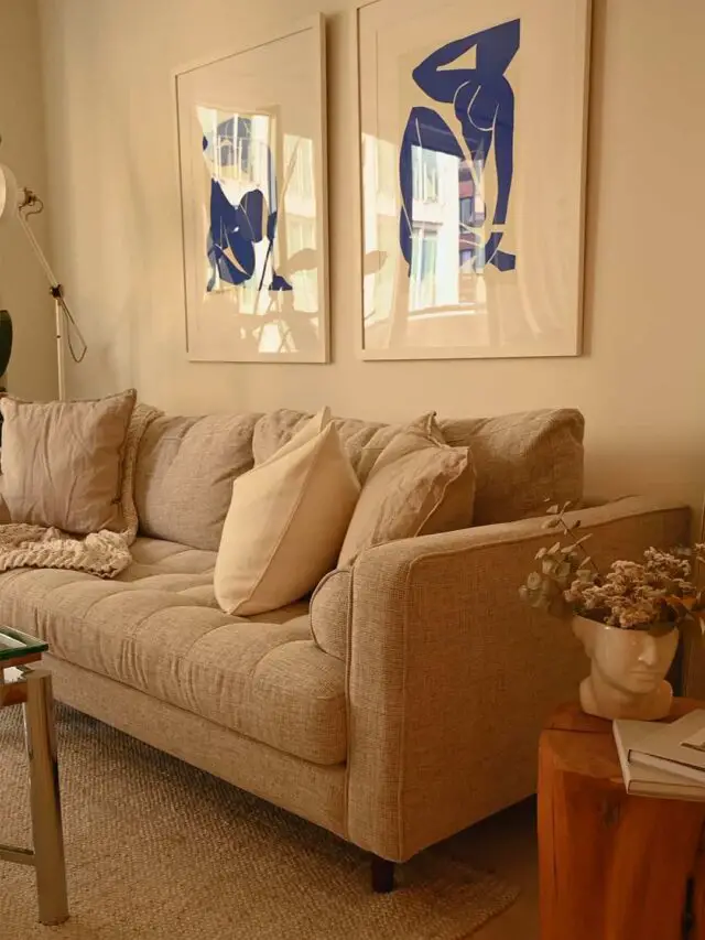
This is my favorite color scheme for the living room and kitchen. Here some examples of the complementary palette and colors for photography.
Who would believe that contrasting colors can look so good?
Whichever color scheme you choose, ALWAYS use 1 primary color and 2 accent colors in your palette.
An alternate resource for those of you who love following trends: Benjamin Moore 2020 color trends palette. It may help you narrow down your color choices.
If you are more interested in creating a color scheme for your house, I have a great post that is only about creating color schemes for the home.
How Psychology of Color Can Affect Mood/Feeling
Here is the most exciting part! This is the magic trick that you need to use in your life NOW.
You read my story about how I felt frustrated about making decisions in the mornings and my daily style.
Remember the colorful dresses in your closet that you bought because you fell in love with them the second you saw them, but you’ve never had a time (or only a few times) to wear them. That is the situation most of us have experienced.
Remember the moment you saw the dress? You can feel that way again by starting with baby steps and changing your everyday clothing routine.
Allow the psychology of color to represent your personality. This is your time to change it.
Let me start by explaining the emotional and mental effects that can be created by color psychology.
For example, if you want to warm the space up and bring energy to it, choose warm colors such as red, orange, and yellow.
However, If you choose these colors instead, green, blue, or purple, you bring calmness.
That is the opposite of what we want. Right?
The truth behind cool colors is one of the most preferred colors in the world. It will never overwhelm you, unlike warm hues.
So if you prefer warm colors, the safe approach would be to use them only as accents.
Let’s take a closer look at the specific colors and their effects:
RED
It awakens intense emotions such as love, passion, strength, courage, and power. Red is generally connected with feelings of love and passion.
As a result, some people think red is the right paint color for the bedroom, but too much red in the bedroom disturbs your sleep. Remember to use warm colors as an accent.
Red can also catch attention, increases confidence, heart rate, and appetite. That’s why most food companies use red in marketing.
ORANGE
It is a lively color that brings excitement, activity, innovation, and socialization. Also, orange can help you in your decision making.
People who love orange are drawn to it because positive companionship can remind us of a beautiful sunrise, sunset, or summer days.
YELLOW
Yellow is a cheerful, warm color and one of the happiest colors. It brightens a space and is also associated with hope and wisdom.
Did you know that this hue can also increase our metabolism and give us energy?
Uses of saturated forms may create eye fatigue and make a baby cry. Yeah, this is an important tip that parents should be aware of.
GREEN
Green is known for evoking calm, balance, clarity, and tranquility; that is why it’s a great choice to help you de-stress and relax.
Green is a color of good health and healing. Organic and natural companies mostly use this color for branding and marketing.
It can also make you feel less tired and enjoy your workout.
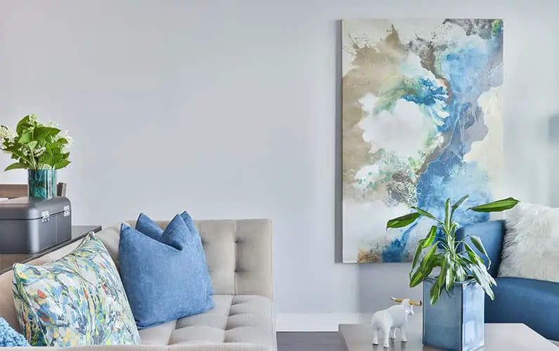
BLUE
This color evokes calmness and a feeling of serenity. It’s like the same feeling of looking at the ocean, but too much use of blue can increase a sense of sadness in some people.
Often used in home offices because blue can encourage creative thinking and boost performance and is also associated with intelligence.
Blue also tends to reduce your appetite. If you have a cafe or restaurant, it’s not a great color to use in the dining area, but if you want to eat less, then blue is your color for your home dining area.
PURPLE
It’s historically associated with royalty, and today it creates a feeling of wealth, success, spiritual awareness, and self-knowledge.
It’s a beautiful color for some people, but others can think it’s just a calming color. Use a purple hue depending on how it makes you feel.
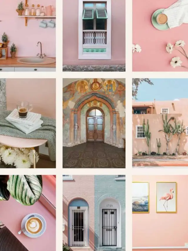
PINK
This color evokes a feeling of love (romantic and platonic), femininity, caring, and thoughtfulness.
The bright pink value also makes you feel calm, but vibrant shades can have the same psychological effects as red.
BLACK
Historically black signifies death and mourning. However, today black lends an air of sophistication, luxury, quality, and elegance in fashion and interior design.
Too much black can make you feel depressed and heavy. We can use black as an accent instead of the main color in our scheme.
WHITE
It signifies purity, goodness, innocence, and creates a clean, peaceful feeling. White is a color of possibility and hope.
Some people said that when surrounded by too much white, they feel that space is too cold, empty, and even unfriendly like a hospital.
GREY
Traditional color psychology says that grey creates passiveness and lack of energy.
I think it depends on how you use this color. If you create a room using shades of grey and lots of textured material, it looks sophisticated.
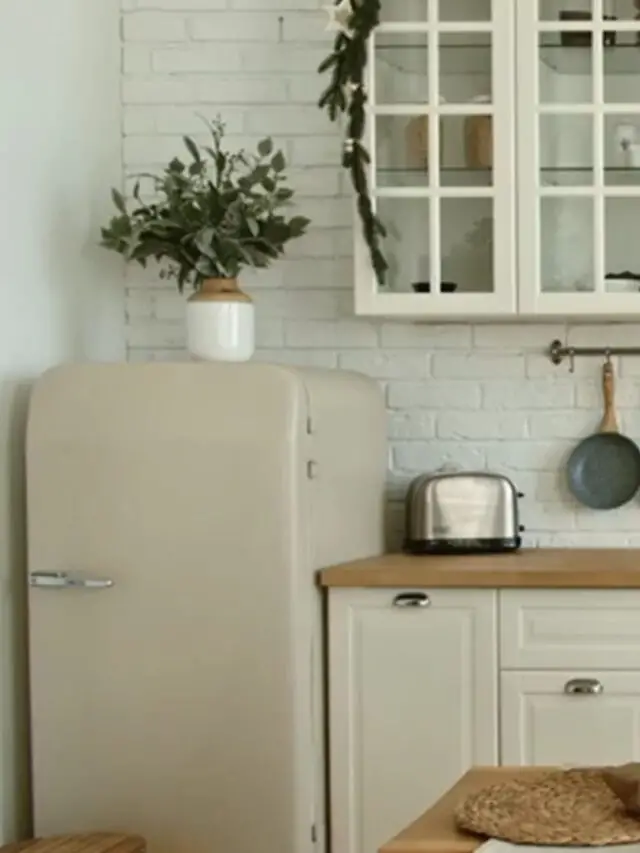
BROWN
Brown evokes feelings of stability, peace, responsibility, and strength. Thinking of brown reminds me of positive things like nature, chocolate, and coffee beans.
On the less positive side, brown has some tones which are tedious and less sophisticated.
Here is a little summary of colors for mood and how color affects mood. If you are going to use your color palette to paint your home, you need more answers.
Create Your Color Palette
One of the best ways to decide on a color scheme for a room or situation is deciding what type of mood you need.
Before you start thinking about what type of mood you want to create, remember that you can change your feeling with color psychology.
If you do not have any idea, just start by looking at your closet. These are the colors that attract you most, and you will be happy with the result.
I prepared some color schemes for each example. I’m also giving you a color wheel and the worksheet to remember these when designing your color scheme.
One more thing to make it easier is this color scheme generator. It is easy to use and allows you to see all the shades and tints at the same time.
Remember that choosing a color should be a fun and exciting experience.
These tips can help you with making decisions and getting the results you want.
Please leave a comment and tell me one thing you learned from this article!
I would love to hear from you.
Hi! Thank you so much for sharing your passion and knowledge. I do home staging and have built and flipped homes for clients for years. Tomorrow I have a color consult for a large new home and although I’ve selected colors for years, I’ve never formally trained for it. Your article helped to give me some points to consider when helping my clients. Best!
So happy to hear that!