


Announcing Color Trends for Home in 2021
It is really exciting to announcing the 2021 home color trends. That’s mean the year 2020 is passing away, and I am ready for this year to be over.
Yet, I believe that 2020 has taught us many things and makes us spend more time in our homes. We work in our homes, isolated, and all of them dragging us to create a unique, personalized home environment.
The major paint companies predict 2021 color trends around different concepts influenced by the past year’s events.
We see lots of optimistic shades to help us create a home where we can relax and feel comfortable. Also, there is always room for unusual, bright colors to add more cheerful to our lives.
Whatever your lifestyle is, I am sure that you can find a color that fits your needs in color trends for 2021.
Let’s delve into these concepts and color trends to create your ideal home environment.
See Also: What Paint Colors You Should Be Painting Your Home in 2023
[lwptoc]
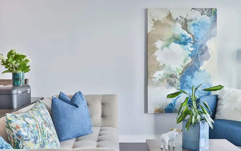
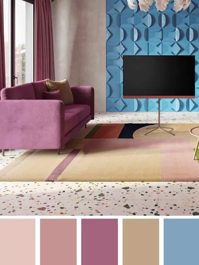
Optimistic Shades
One of the main concepts in 2021 color trends is to bring happiness into interior space.
Color psychology exists, and we can change our mood with colors. So why not we carry happiness into our homes?
I know that we all want to forget about 2020 and all the exceptional events between. These optimistic shades will make you happy in your home environment and help you make a fresh start to 2021.
Paint companies selected some clear colors, neutral shades, and bright colors inside their 2021 color trends to bring an optimistic feeling to our homes. This variety is an opportunity for everyone who wants to create happy spaces.
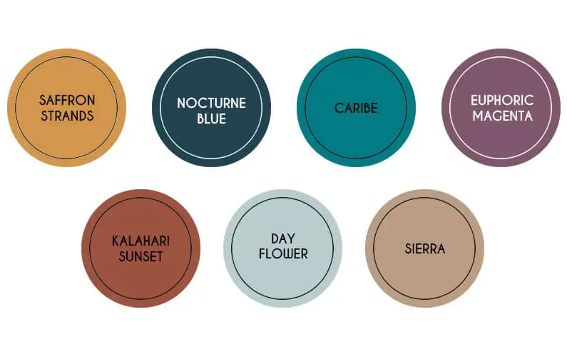
Optimistic View by Behr
Behr announced their “Optimistic View” color palette. Behr color trends for 2021 includes lots of shades from bright yellows and purples to warm and cool undertoned neutral shades.
Saffron Strands, Euphoric Magenta, Kalahari Sunset, and Caribe are perfect hues for who wants to bring instant energy to any space and wish for eclectic house decor.
On the other hand, Day Flower and Nocturne Blue are the hues that I choose inside the Optimistic View color palette to evoke calm and relaxing energy.
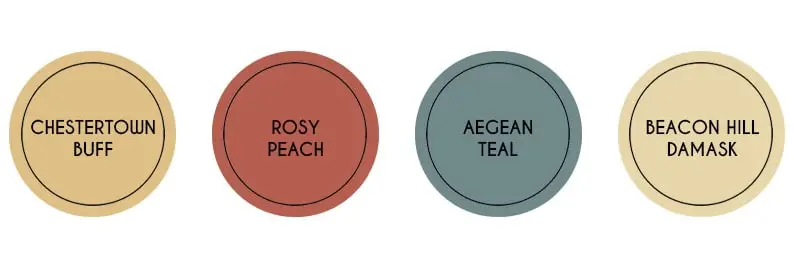
The Trend Colors 2021 Palette by Benjamin Moore
Benjamin Moore announced their “The Trend Colors 2021 Palette” with lots of colors perfect for this year’s color trend concepts.
They have Chestertown Buff, Rosy Peach, Aegean Teal, and Beacon Hill Damask on the optimistic shades. These are perfect colors to use in your living room and entryway as an accent wall.
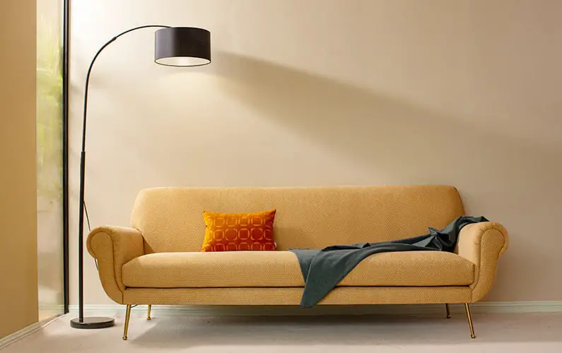
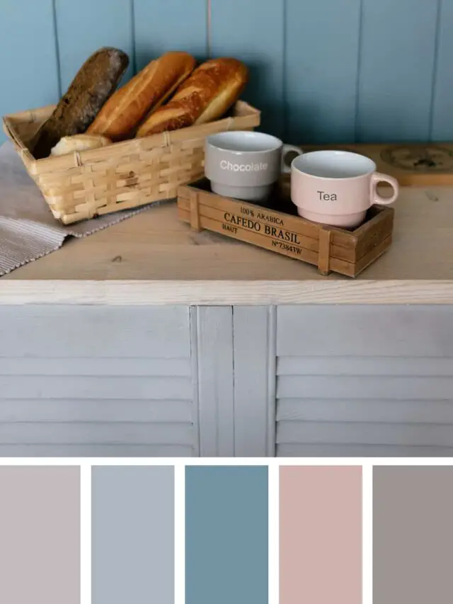
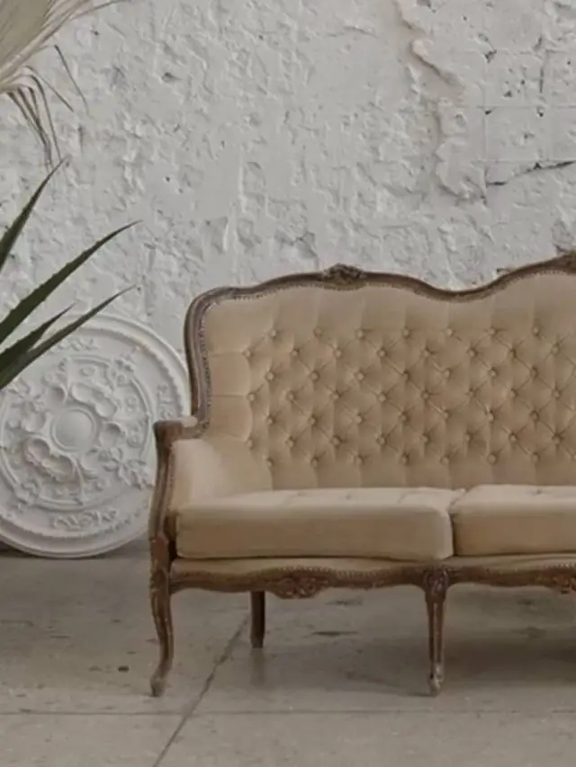
Warm Comforting and Rustic Tones
The power of using warm colors is about to adopt any space into a cozy and homey feeling. Color trends for 2021 in most paint companies are aiming for that feeling.
Not only creating warm space, but these trends allow us to create a rustic feeling, which is one of the favorite design trends in recent years.
Rustic interior design styles are known for using various neutral shades which has cool undertones. Seeing these warm and rustic colors make me thought that we could expect different design trends and new design perspectives on rustic design styles.
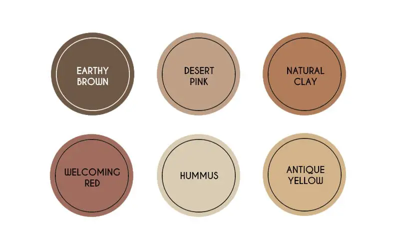
Jotun Reveals the Color Trends in 2021
Earthy shades inspire Jotun’s choice of warm and rustic colors. They defined these shades as the essential building blocks of human life because coming from the colors of raw materials such as clay, stone, sand, and soil.
Earthy brown, Desert Pink, Natural Clay, Antique Yellow, Hummus, and Welcoming Red are the warm rustic Jotun’s home color trends in 2021. You can confidently use these colors in your bedroom or family room.
These colors are perfect for combining with each other because of the neutral chemistry. They never tire your eyes, unlike other warm color combinations.
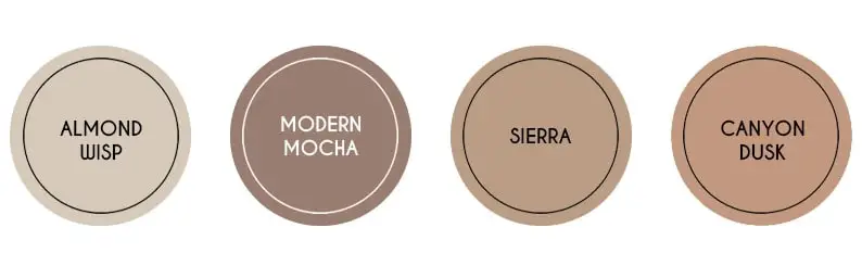
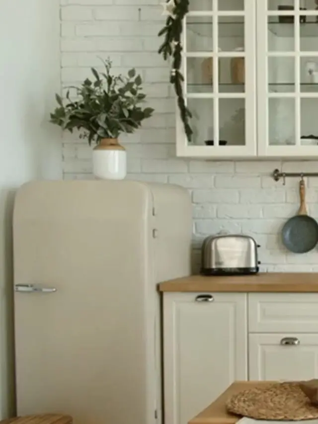
Casual Comfort by Behr
“Casual Comfort” is another color theme that the Behr paint company announced as the 2021 year color trends. In this theme, you will see the light neutral colors and whites with warm undertones.
Almond Wisp, Modern Mocha, Sierra, and Canyon Dusk are the colors you should work with to create an inviting feeling this year. Use these warm colors in your entryway, kitchen, and open living room spaces.
Color of the Year 2021 by Sherwin-Williams
Unlike other paint companies, Sherwin-Williams has announced the only color of the year, Urbane Bronze. The color was inspired by the two Earth’s stones, wood, and metal.
As soon as you look at the color, you can realize the feeling of both coolness of metal and warmth of wood, which is very interesting.
I call this color interesting because most black color tones have cool undertones, and the black color is cold neutral. However, Urbane Bronze is a perfect color example for dark and warm featured neutral colors.

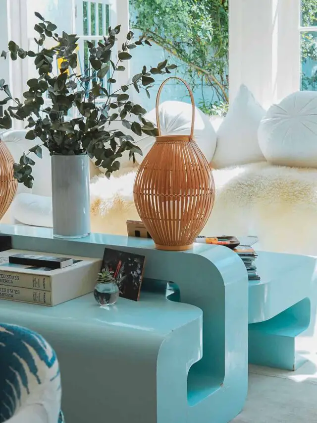
Nature is the Inspiration
Nature is an inspiration source of every aspect of design, architecture, and interior decoration. This was an important theme in 2020 home color trends, and it will continue to be a popular trend and inspiration source for decades.
These trends are aiming to increase our awareness and the importance of sustainability. Nature was given us a limitless source of inspiration.
Using these colors in your house will remind you of the outside’s freshness and keep you calm in your home interior.
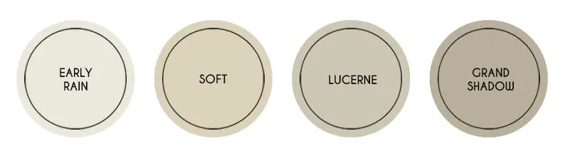
Soft Neutrals by Jotun 2021 Color Trends
Soft Neutrals by Jotun were created with the idea of escaping from noise and clutter in the real world. Briefly, these colors help us down the volume of our homes and remember to celebrate simplicity.
I do not see colors just inspired by Nature hues in the Jotuns theme.
Rather than using colors from nature, as a concept Jotun inspired the feeling of calmness and clarity, which we all know that we couldn’t find this feeling in our cities most of the time.
Early Rain, Soft, Lucerne, and Grand Shadow are the colors you can use to create minimalist but warm interiors. You can create a monochromatic home palette by using these colors together.
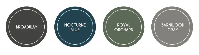
Quiet Heaven by Behr
Quiet Heaven color palette by Behr aims to create our oasis in our home with the colors come from nature itself. Rather than light shades, Behr preferred the deep hues to represent nature as sublime and dependable.
Broadway, Nocturne Blue, Royal Orchard, and Barnwood Gray are ready for making a difference in your interiors with expressive dark colors.
These are the color trends for 2021, which are announced by some paint companies. I will add other colors as soon as they release.
I loved every color in this year’s list, but my favorite color in 2021 trends is Urbane Bronze.
What is your favorite interior color in 2021?
I’m really tired of the “chalks” and “blues”..this year leaning to the mustards cheerful reds and warmer greens.help
Natural clay will never tire my eyes!
I’m missing the tranquility of fresh natural greens in 2021’s trending colors.
Just adore the colour trends for 2021. I don’t like brights and all these muted tones are so easy on the eye. They will not date quickly either. Must admit to being over grey!!!
I totally agree with you. Bright colors are always be my last choice when choosing a paint color for any room.
I literally just picked out Kalahari Sunset for an accent wall in our master bedroom…my husband says it’s too dark but I absolutely love it
Amazing! I love these fresh colors in a bedroom. So happy that you like the color.
LOVE these colors. My son would love them if he could see them on house trim stucco conbination
Very Innovative, Your article is very useful about the colour trends in 2021. Searching for the colour trends blogs nowadays.
Thank you for the lovely comment 🙂
I’m looking for some advice and color combinations/selection throughout living area. I would like white trim and cream or neutral light color. I know have Martha Stewart ashbark and white trim. Any suggestions would be much appreciated.
Hey Heather! Thanks for reaching out. I just want to remind you that if your space isn’t big enough, I recommend you paint the trim and the wall color the same. This feels larger, but If you have a good size space, you can choose to paint them different colors. I want to give you some color suggestions from 2022 color trends cause creamy neutrals will be so popular. Check on “Natural Linen,” “October Mist,” and “Pale Moon” from Benjamin Moore. More, “Caravan” and “Pale Linden” from Jotun, “Ancient Marble” from Sherwin-Williams will perfectly fit your white trim combinations. Let me know what do you think 🙂