


Color Trends for Homes in 2020
See Also: 2022 Home Color Trends for Those Who Want a Fresh Start
The title “Color Trends for Homes in 2020” is a bit cheesy, I know, and if you are interested in home decoration, you have already seen some of these trends like Pantone, the classical blue everyone is talking about.
Rather than introducing colors, I want to go over 2020 color trends and touch on some points like where to use or how you can apply trending colors in your home.
I assume that you are not an interior designer, and you don’t need to know all of these trends. However, you may wonder about a designer’s perspective.
To be honest, companies are making these trends to increase their profits, and it is not realistic to follow color trends every year in home decoration.
It is possible to dress with the latest trends and colors in fashion, but it is much more expensive and time-consuming to stay current with home decoration trends.
So what’s the point of knowing these color trends?
No one wants to be out of fashion. Following these trends and making some changes in your home decoration is an easy and affordable way to have a fashionable home. Colors are a natural way to create interior design ideas while staying on a budget.
Color trends affect a massive industry. From wall paint to home textiles to home accessories (everything you need for changing your home decor), every firm is affected by these trends throughout the year through producing or designing with the colors in the latest trend.
This means if you decide to make changes in your home design this year (2020) and use the colors in these trends, you can find more options in home decor items.
Color is an easy way to change your home atmosphere. Making some color changes or adding some trendy colors to your home color palette is an effective way to get rid of an old, out-of-date look.
I researched and selected some colors from the latest trends, merged them in this article, added my perspective, and created some color palettes with these color trends.
You can easily use these color palettes if you want some changes in your home decor. Just adding them into your accessories or decorating with these colors is a great way to refresh your sweet home.
[lwptoc]
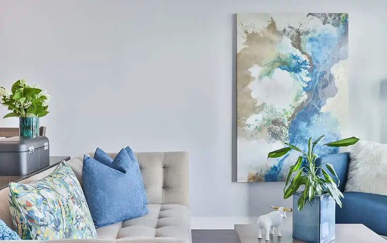
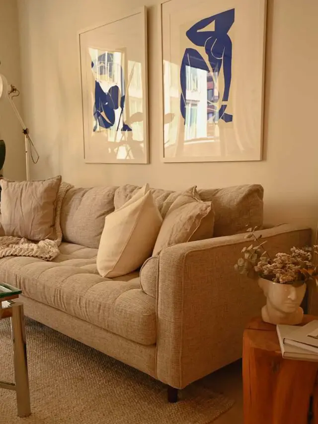
Pantone Color of the Year: Classic Blue
Pantone announced that their color of the year is ‘Classic Blue, ’ which is simple, timeless, and enduring. We have known that since primary school art classes; it is simple, but the concept behind it is not.
Classic Blue represents the ‘desire for a dependable and stable foundation on which to build as we cross the threshold into a new era.’
Blue is a cold color that evokes the energy of serenity, stability, and calmness, which is the main reason why Pantone defines ‘Classic Blue’ as their color of the year.
Adding a color such as blue (the cornerstone of colors) to anyone’s home decor should be easy because it is already prevalent in most of our homes.

If you are not using blue and already have cool color schemes in your home, you may want to consider adding blue to your color palettes.
How can you do that?
I was hoping you could choose the least colorful room for a fresh look because matching the color undertones is not easy.
Rooms that are primarily decorated with neutral colors are perfect for adding colorful home accessories.
Because the psychology of the color blue, bedrooms, bathrooms, and home offices are the best places to apply blue. Making changes in walls and adding some home accessories will help you harmonize the blue hue in any room.
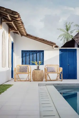
The blue color is associated with a coastal chic interior design style. If you are using coastal chic as your home style, then it’s a piece of cake to redecorate both your interior and exterior.
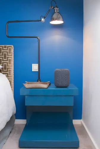
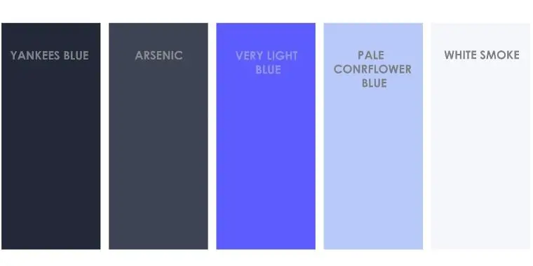
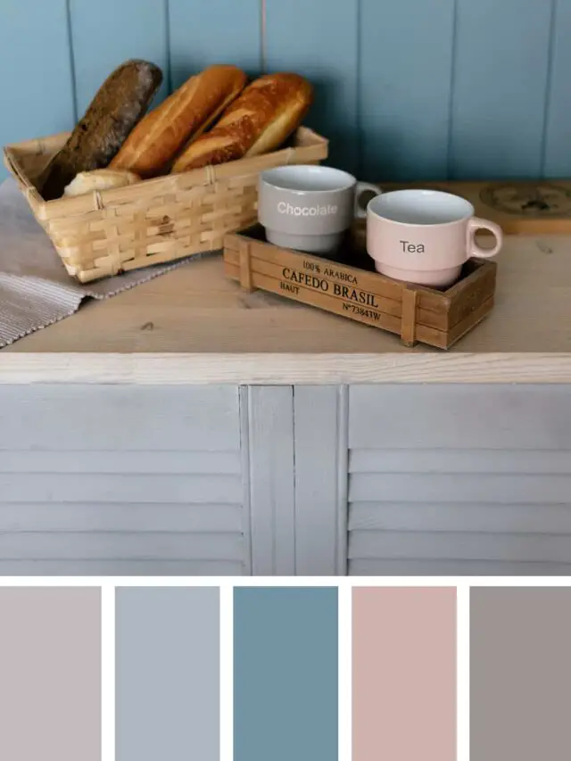
The number one thing to creating a color palette with ‘Classic Blue’ is to match the undertones, which means using cool colors. The color palette I made is a monochromatic blue color palette.
You can adapt this palette in every room with confidence. As I said, blue is suited for a bedroom because it creates a feeling of serenity and calm.
Paint your main walls white smoke color, arsenic for the wall where your bed leans against, and use the others for your room accessories; Can you visualize it?
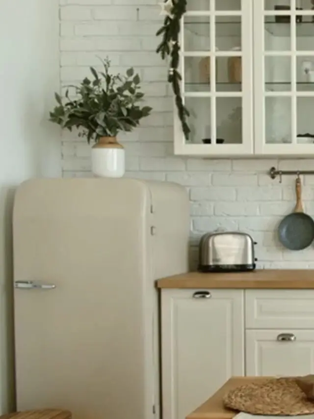
Behr Paint Color of the Year: Back to Nature
Color company Behr selected the color ‘Back to Nature’ as the 2020 color of the year. ‘Back to Nature’ is nature’s favorite color, green, and aims to bring nature inside our houses. Like Pantone, Behr has a great concept behind this color choice.
As you know, because of the world crisis, most significant companies are trying to emphasize the importance of sustainability.
Interior design industries are trying to use natural materials rather than unnatural ones, with the colors of these materials coming from nature itself. Matching these materials with colors like ‘Back to Nature’ is popular.
Green represents calmness, balance, good health, and every feeling nature provides. Using green color in your home decor is always a great choice.
My recommendation is to use green color in your work out areas because color science states that green makes you feel less tired and will help you enjoy your work out.
Using green colors in a meditation room (can be an area, not a whole room) or a space in your living room you use for your yoga poses (like me) is the perfect option because it’s calming to look at while meditating or doing yoga.
Don’t forget to add some natural elements into your design with home accessories like plants to harmonize the space.
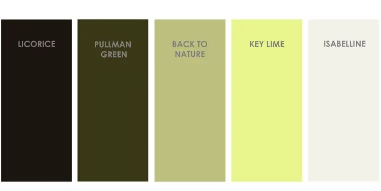
The color palette I created using ‘Back to Nature’ includes a vibrant hue ’Key Lime’ and is combined with other neutral colors. ‘Zinnwaldite Brown’ is brown with a green undertone. Using this trick, combining color undertones, is an easy and safe way to create unique color schemes.
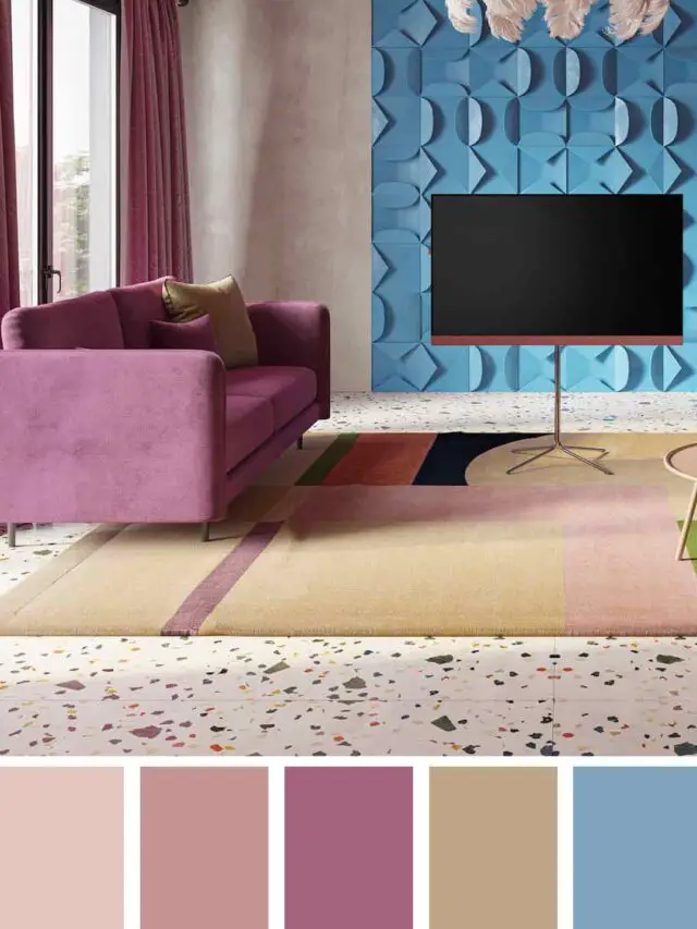
Benjamin Moore Color Trends 2020 Palette
Rather than introducing one color of the year, Benjamin Moore created a color palette on their website with the latest trends and added application projects using this palette.
I highly recommend you look at these application projects to get inspired. Visually seeing colors are a better way to look at your options and decide on your colors.
I realize this color palette shares similarities with other companies mentioned in this article.
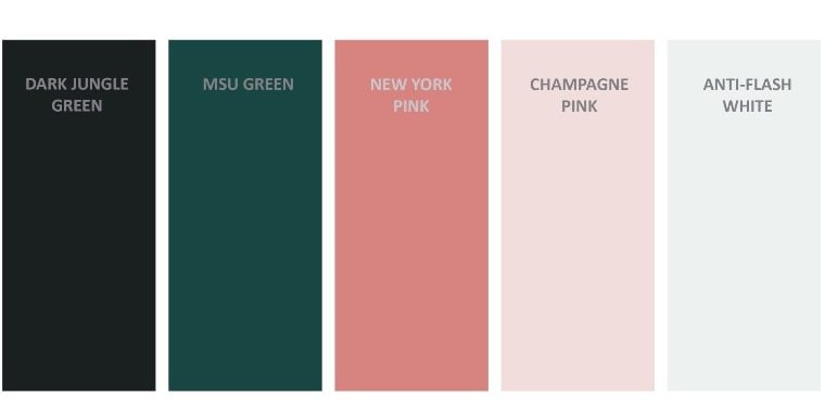
Benjamin Moore ’The Color Trends 2020 Palette’ consists of colors containing different blue and green undertones, which are the trend colors of other companies.
When analyzing these trends, the results show that primary colors are more trendy than other hues in 2020. We see all big companies trying to simplify their trend colors.
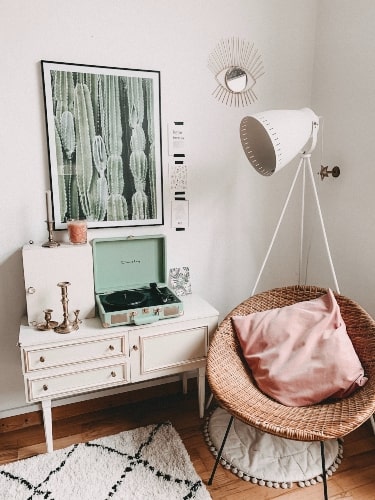
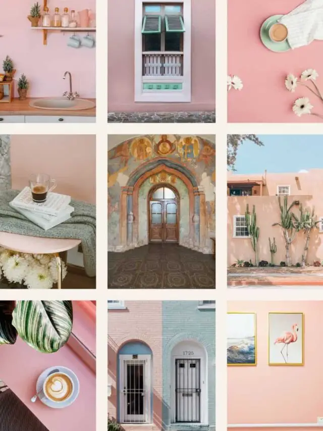
‘First Light’ is a beautiful shade of peachy pink. According to Color science, pink evokes femininity, calmness and creates a romantic environment.
The best spaces to apply the color pink are bedrooms, kids’ rooms, kitchen cabinetry, and an accent wall in your living areas.
Painting your walls might be a considerable challenge; it is still an option to use these colors in your home accessories.
Designers’ Choices
Besides these large companies, the designers are announcing their choice of color of the year. I did some research, selected some colors I am in love with and can say are my favorites.
Peacock Green
Peacock Green is such a dramatic color that can help you boost your appearance and chicness.
Jewel tones arrived on the scene (how long ago?) and continue to be a part of trends year after year. All shades of peacock green incorporate luxury and drama.
Peacock green is an excellent color for your dining room, living spaces, or guest bedroom providing a luxury feeling for your guests.
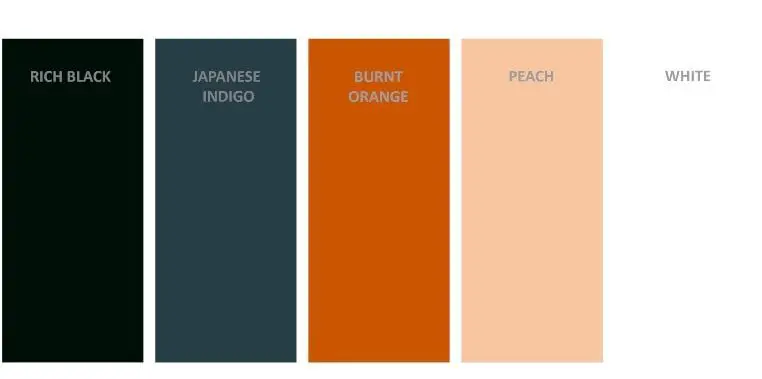
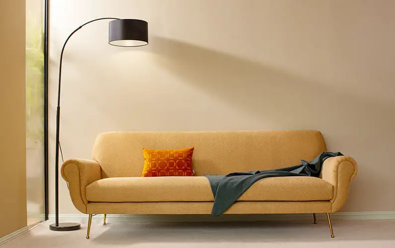
Burnt Orange
Burnt orange is a vibrant hue that attracts a lot of attention. Besides these natural tones, orange is an exciting, cheerful color that can bring instant energy to any space.
Rather than using it as a primary color in your home color palette, I advise you use it as an accent.
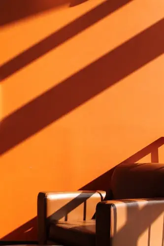
I want to warn you that you do not want to use this color in your dining room or kitchen because the energy of orange increases hunger.
I would love to hear what you think about these color trends and if you are considering making changes in your home design, notify me: my help could be useful.
Please feel free to leave a comment below this article and let me know if you have any questions that I can answer!
0 Comments